
Before and After: Cambridge Midcentury Refresh
- Jul 13, 2017
- 3 min read
Updated: Apr 16, 2018
Cambridge, Massachusetts is known for its history and charming neighborhoods. This home is located on a quaint little street just outside of Harvard Square and was bursting with character. The family of four (and pup) craved a cozy, yet stylish and colorful space that was functional for their busy lifestyle (i.e. space for games, friends, movie nights and homework). They had just painted the walls white and I decided that was a perfect neutral backdrop to hang their amazing artwork and layer with colorful fabrics and patterns. The redesign consisted of the connecting living and dining rooms. I love how the concepts relate to each other in each space and really reflect the personality of the sweet family.
LIVING ROOM


BEFORE: Oversized seating, undersized rug and a lack of color.
AFTER: A new, brighter sofa (in performance fabric of course) centers the space and is a favorite of Emila. I am obsessed with the Rebecca Atwood potato print pillow and the midcentury artwork that the family previously owned. A neutral, textured wool rug now grounds the entire space.
There is also a beautiful capiz chandelier in the space that was difficult to capture, but you can see it in the concept below.

A lucite coffee table was used to keep a low profile in the narrow space.

BEFORE: The layout was a little tricky, as the the living room is right off the entry and you must walk through it to get to the rest of the home. The door in the before photo below is the entry.


AFTER: While we still had to keep most of the furniture pretty close to the walls, I made each space feel purposeful. Below is the new media console that camouflages the large speakers with books and a gallery of family photos (the white console is from IKEA and $99). Mounting the TV as part of the gallery also helped to make it feel like less of a focal point. The solid teak bookcase has geometric details that make it feel like a work of art.


I placed a simple round mirror above this midcentury heirloom and minimally accessorized to make it feel fresh.

BEFORE: Wasted space in the corner and an awkwardly placed sconce.
AFTER: Cozy armchairs upholstered in a gorgeous navy performance fabric flank a marble and brass side table. The fig tree, orchid and embroidered pillows add an organic element.


DINING ROOM
BEFORE: the dining room was really bare and lacked color and functionality - the dining table wasn't large enough for large family dinners and the buffet was TOO large for the space (though beautiful).

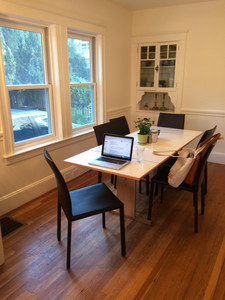


AFTER: My favorite part of this redesign was the Hygge + West wallpaper - it is subtle, yet impactful. That is what makes a design - when each detail is carefully thought of to create a look that feels like it was always meant to be there. The client had amazing artwork in storage that we incorporated. The sputnik light fixture was handmade by Lucent Light Shop and the vintage midcentury table was purchased in New Hampshire and extends to seat ten.
Action shot of flower arranging, wallpaper details, a beautiful Jill Rosenwald vase and vintage watercolor of Venice.


The new buffet is also vintage and in period with the rest of the pieces. I love how the patterns in the teak veneer, abstract art, and wallpaper all work together. The teak also compliments the living room bookshelf. The Cedar and Moss Sconces were added as well to give a soft glow.


I say this every time, but I am so grateful for wonderful clients like this who trust me to design their homes. It really is a privilege.
A big thank you to Nicole Baas for these amazing photos.
This project was also featured on HGTV.com - full story here.


Comments